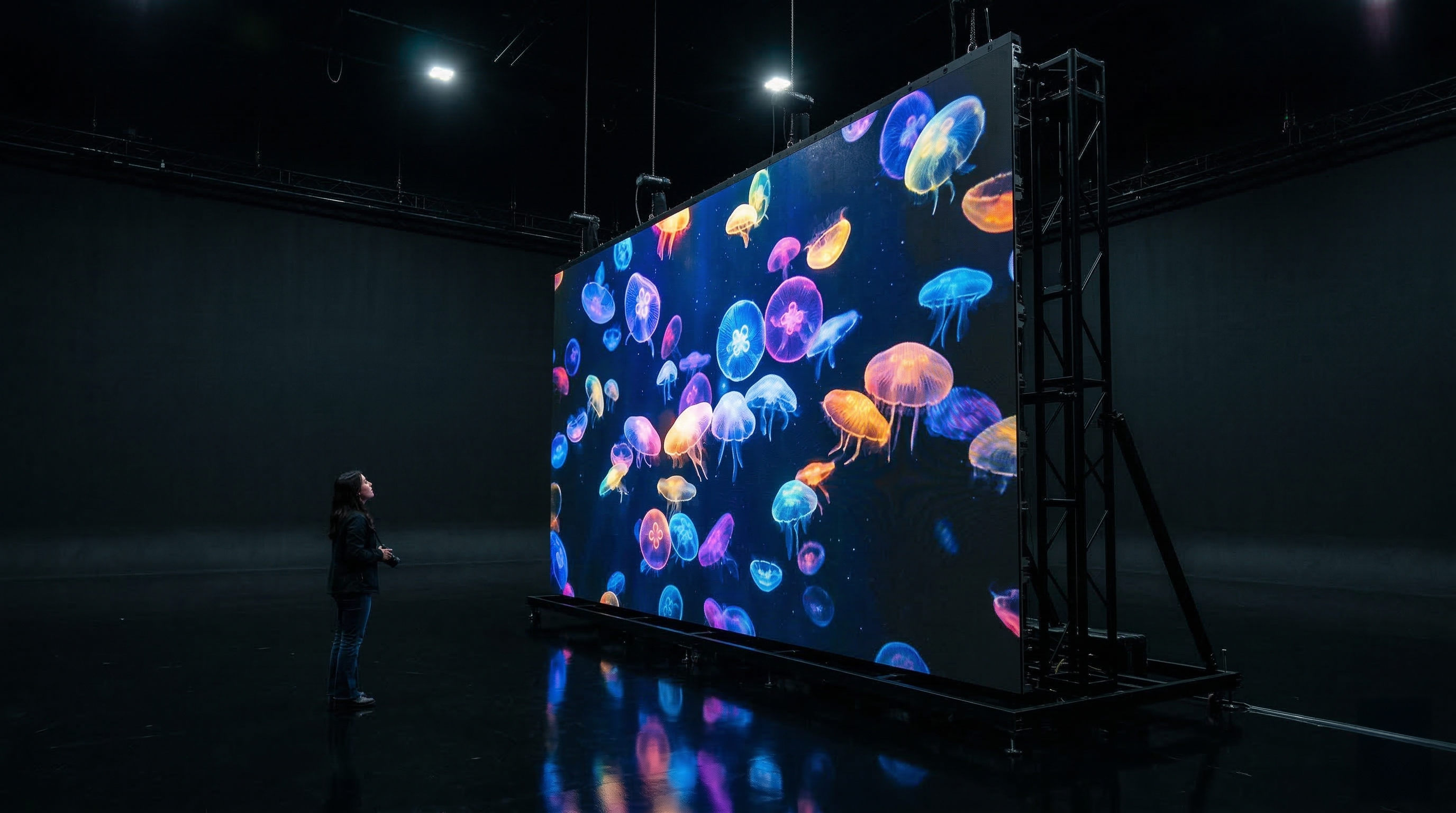




Why Color Is a Brand Asset
A signature burgundy, a precise silver, a deep black, or a carefully defined blue can carry years of brand memory. When these colors shift on screen, the brand can feel less premium, less consistent, or less trustworthy.
For LED display projects, color accuracy is therefore not only a technical subject. It is part of brand management.
The Anatomy of Color Deviation
Color differences can come from LED batches, module age, brightness settings, viewing angle, temperature, control parameters, or inconsistent calibration. Even small variations become visible on large surfaces.
Without calibration, a display wall can show uneven whites, mismatched modules, oversaturated tones, or skin colors that feel unnatural.
Grayscale and Low-Brightness Performance
Premium image quality depends heavily on grayscale behavior, especially at low brightness levels. Indoor environments, studios, corporate spaces, and retail stores often need subtle gradients and soft tones instead of maximum brightness.
A well-calibrated display keeps detail visible in shadows, highlights, and midtones.
The Balance of Hardware and Software Calibration
Accurate color begins with quality hardware, but it is maintained through measurement, correction, and regular calibration. Control systems, color management tools, and service routines all help keep the display consistent over time.
The strongest results come when calibration is treated as part of the project lifecycle, not as a one-time final step.
Protecting the Brand on Every Surface
For Xeron, color accuracy means making sure the digital surface respects the visual identity it carries. The screen should amplify the brand, not reinterpret it by accident.